

Summer Conference
Client: North Dakota Farmers Union
Focus: Event Branding & Communication
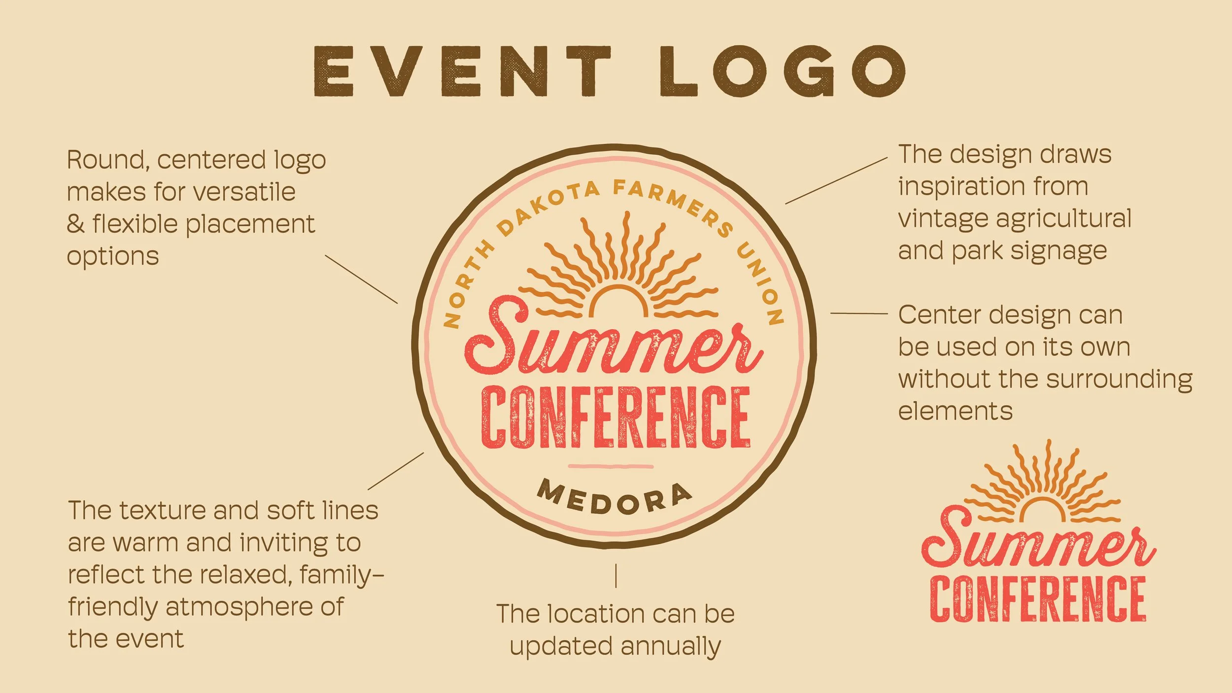
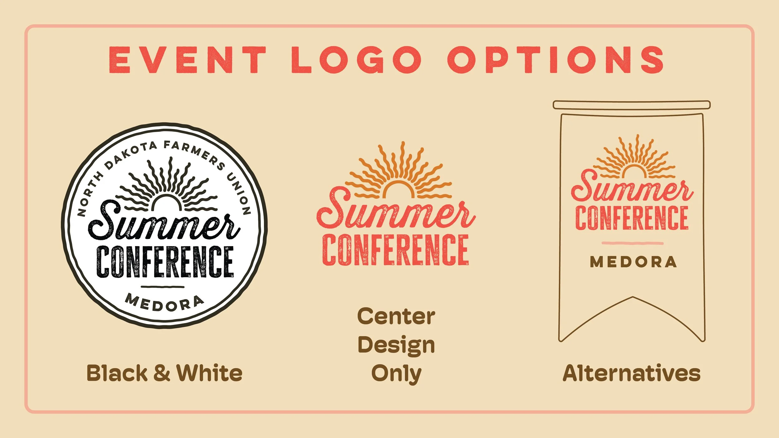
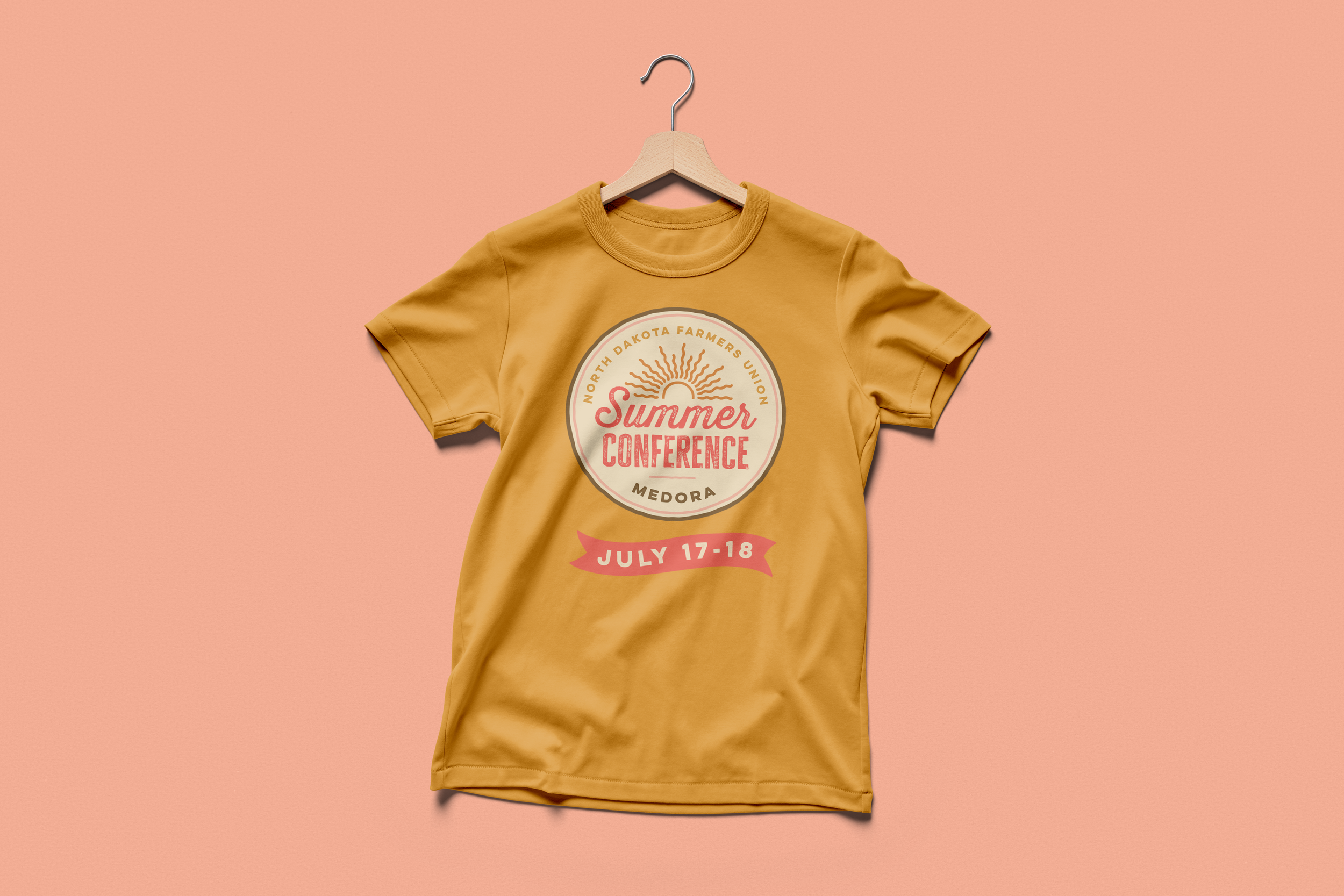
For North Dakota Farmers Union’s inaugural Summer Conference in Medora, I developed a cohesive visual identity and communications system designed to carry attendees from initial promotion and registration through the event itself. The project included the event logo and branding, promotional materials, registration graphics, magazine advertisements, signage, name badges, and a 16-page participant booklet.
Because the conference combined educational sessions, entertainment, youth activities, transportation, and multiple event locations, organizing information clearly was as important as establishing a recognizable visual identity. I developed materials that maintained consistent branding across print and digital applications while helping attendees easily understand schedules, transportation, activities, and other event details. The resulting system gave the new conference a distinct identity while creating a reusable foundation for future events.
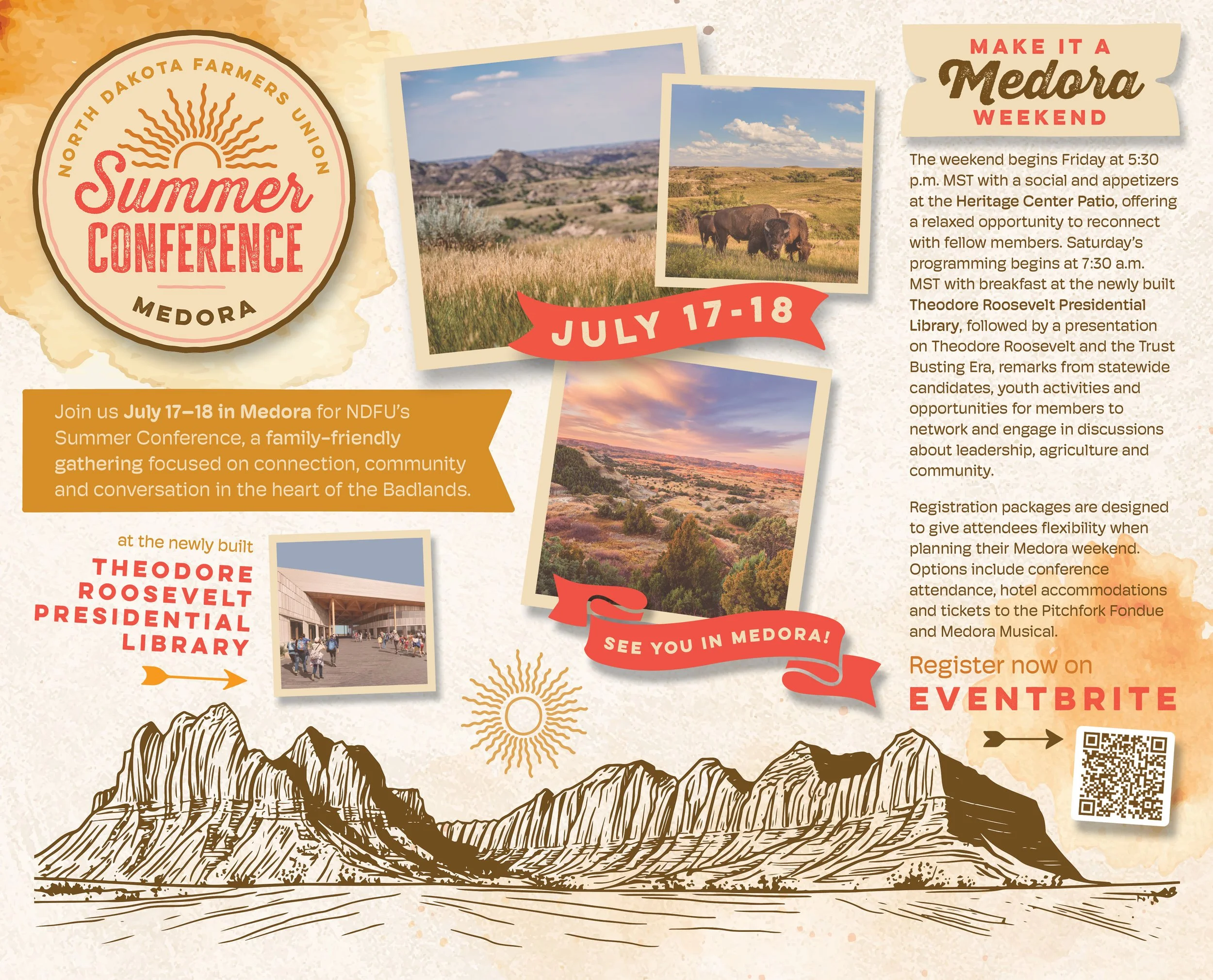
Union Farmer Magazine Advertisement
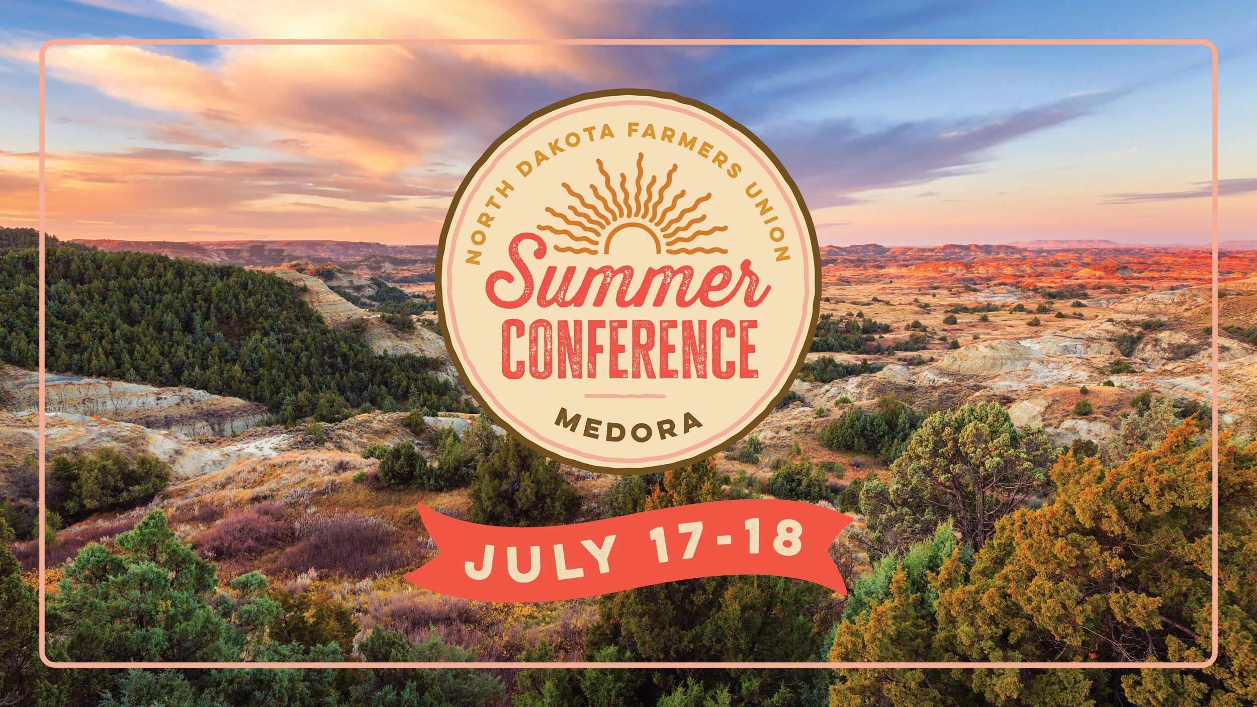
The Union Farmer is NDFU’s member publication, distributed to members across the state and featuring organizational news, agricultural issues, programs, and upcoming events. I designed a full-page advertisement for Summer Conference to build awareness of the new event and communicate key registration information while introducing readers to its visual identity. The design uses the conference’s established branding, photography, and messaging to capture the relaxed, community-focused atmosphere of the event and direct members toward registration.
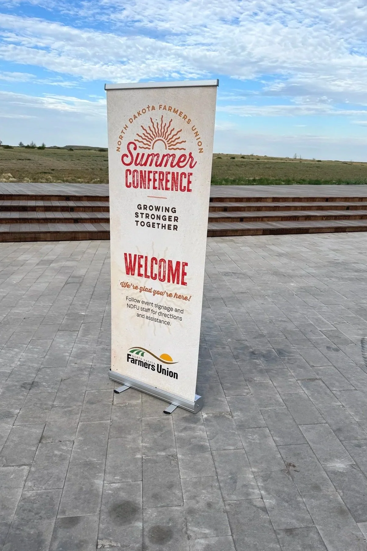
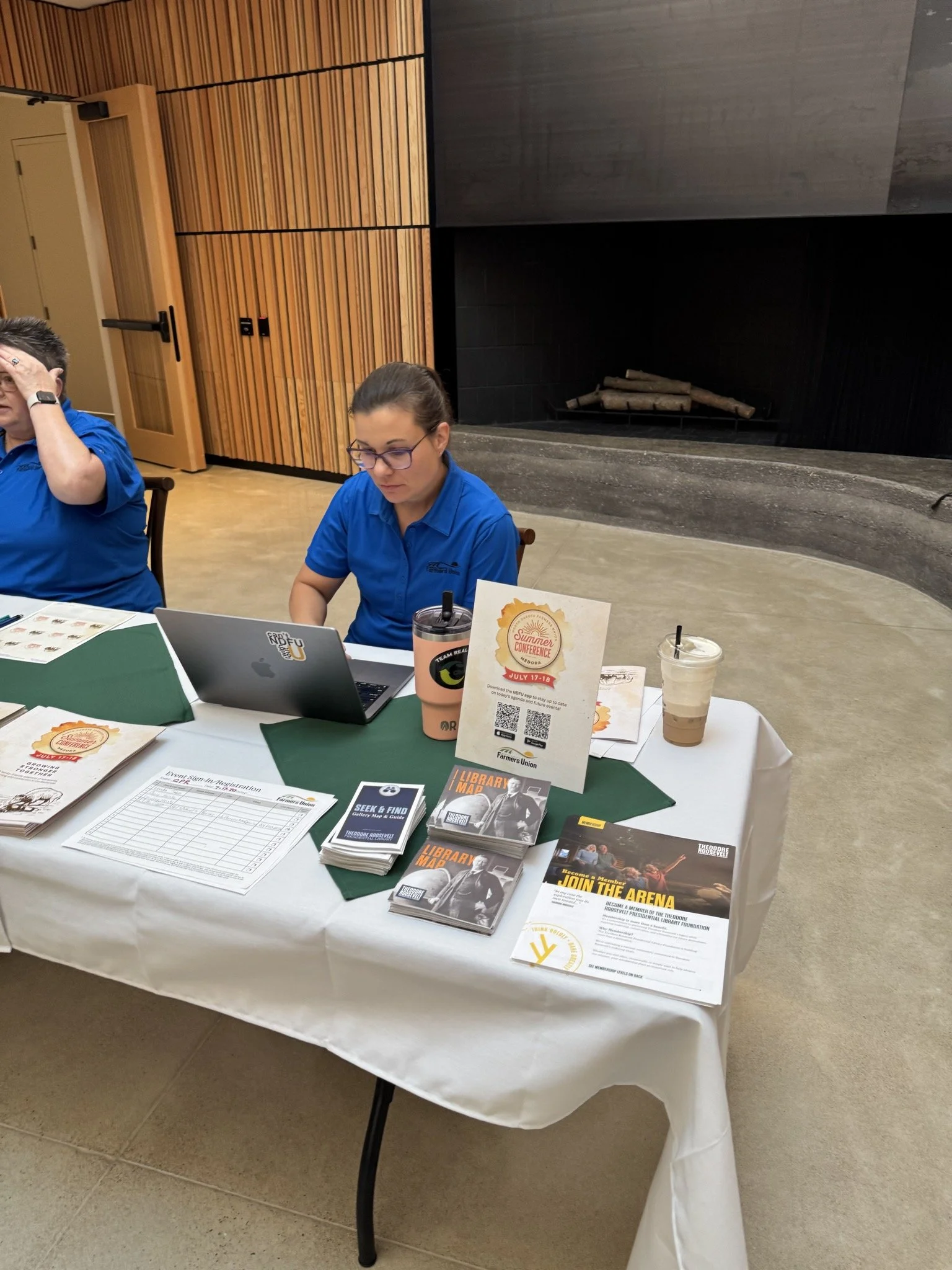
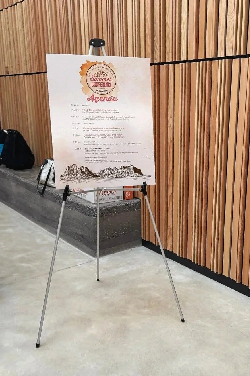
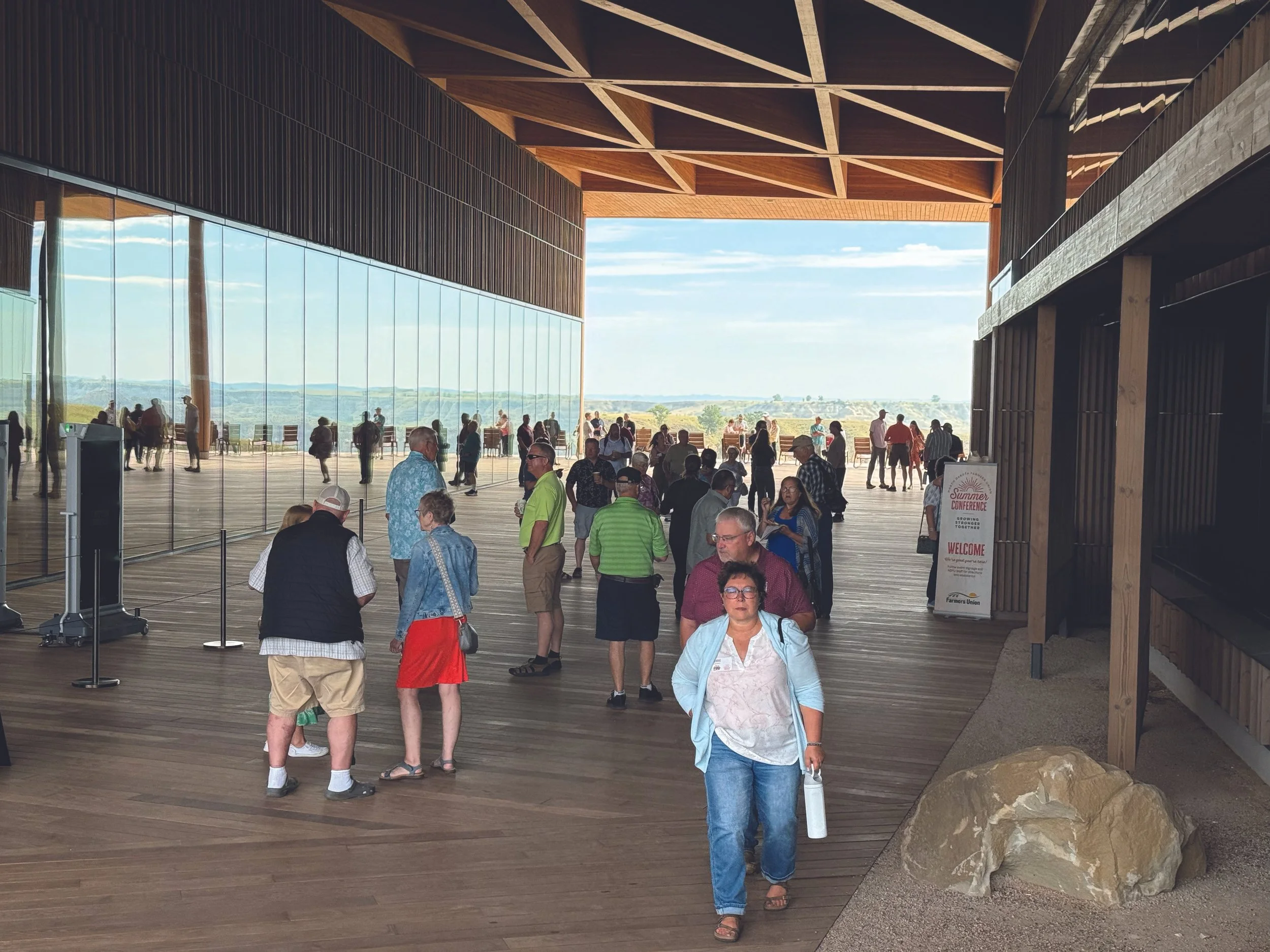
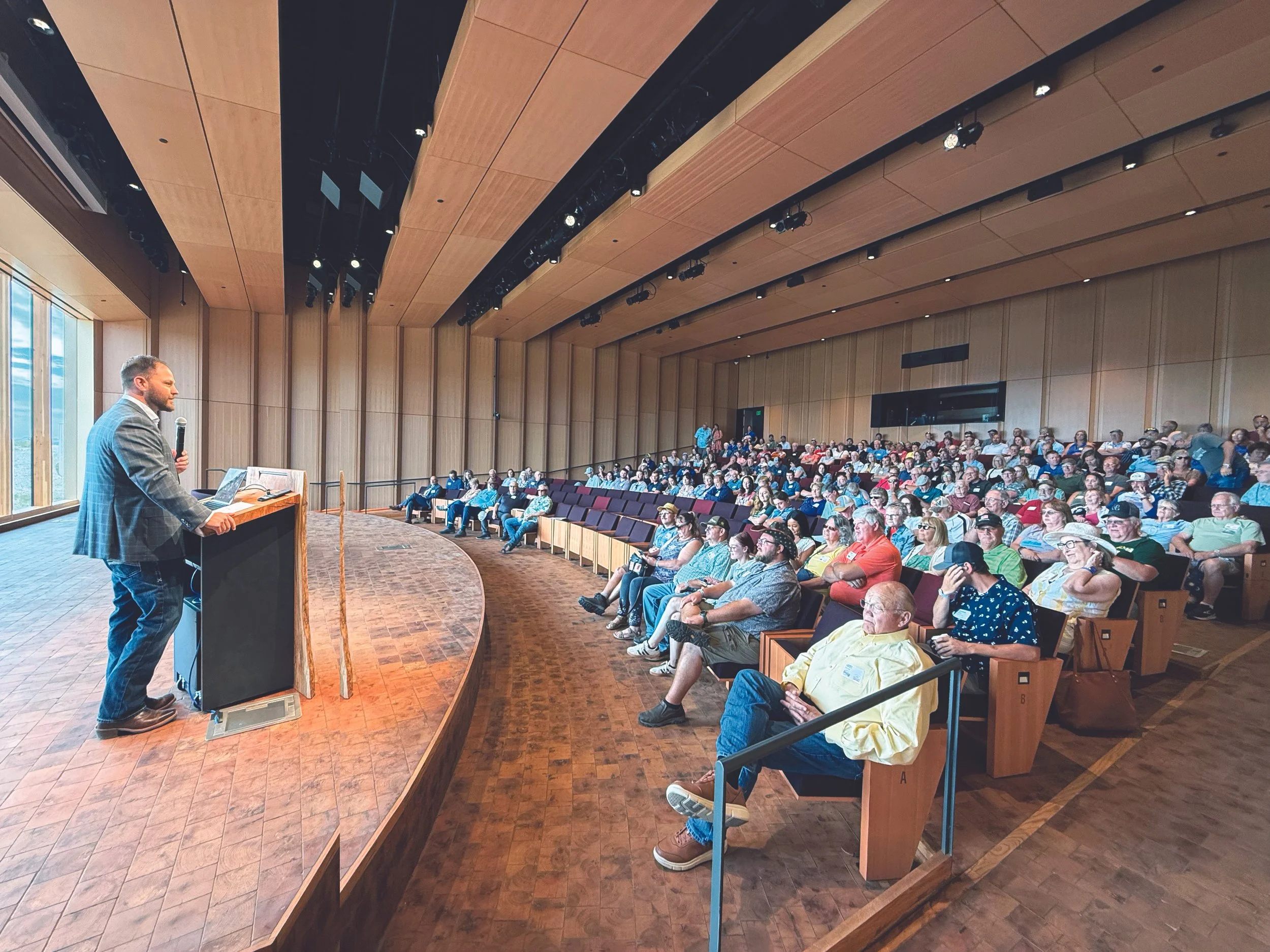
Summer Conference in Action
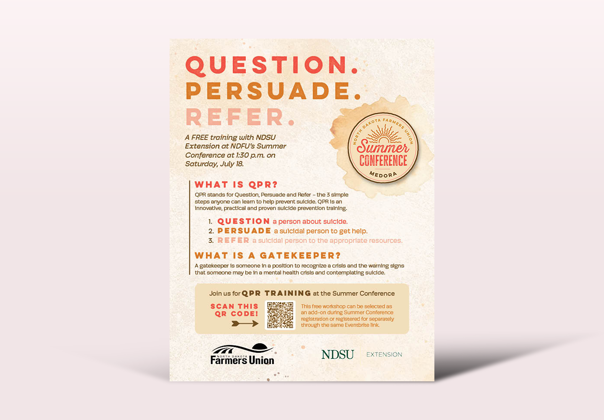
QPR Training Flyer
This promotional flyer highlighted a QPR Suicide Prevention training offered as part of Summer Conference programming. The design maintains the broader conference identity while giving the training its own clear visual hierarchy, making essential information clear to understand, including the session purpose, time, and limited availability. The piece demonstrates how the event’s visual system could adapt to individual programs without losing overall brand consistency.
Summer Conference Participant Booklet
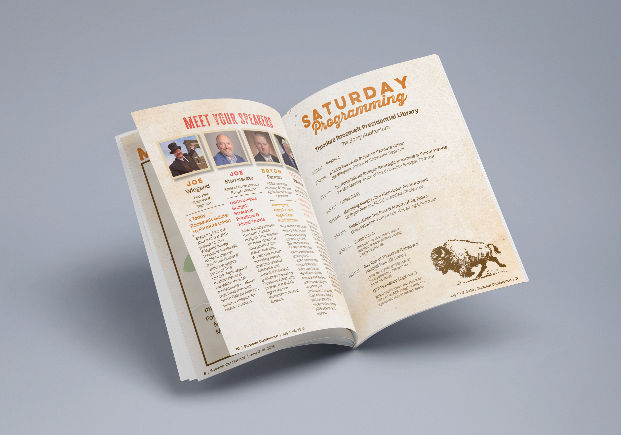
This 16-page participant booklet served as a comprehensive guide to Summer Conference, bringing together schedules, activity information, transportation details, maps, entertainment, and other important resources. Participants received the booklet digitally in advance to help them prepare for the conference and could reference it throughout the event. With a large amount of information spanning multiple activities and locations, the primary design challenge was creating a clear, easy-to-navigate information hierarchy while maintaining the conference’s established visual identity.